Coquina
Coquina is a brand that celebrates quality food and nature while creating meaningful experiences for their customers.
I wanted to create a whole visual system that works for all the different services they provide — from catering, to private chefs, to outdoor retreats.
So the plan was simple:
- Go outside.
- Spend more time in nature.
- Notice how everything works together in symbiosis.
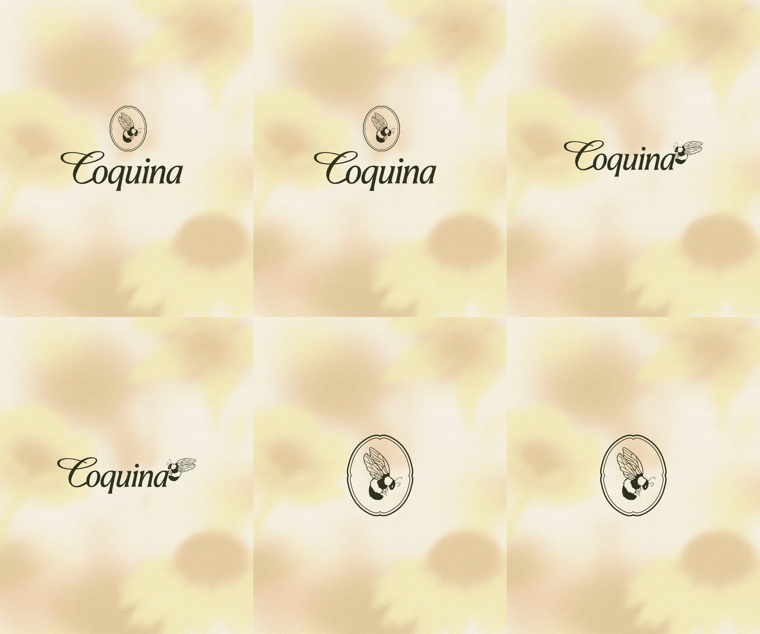
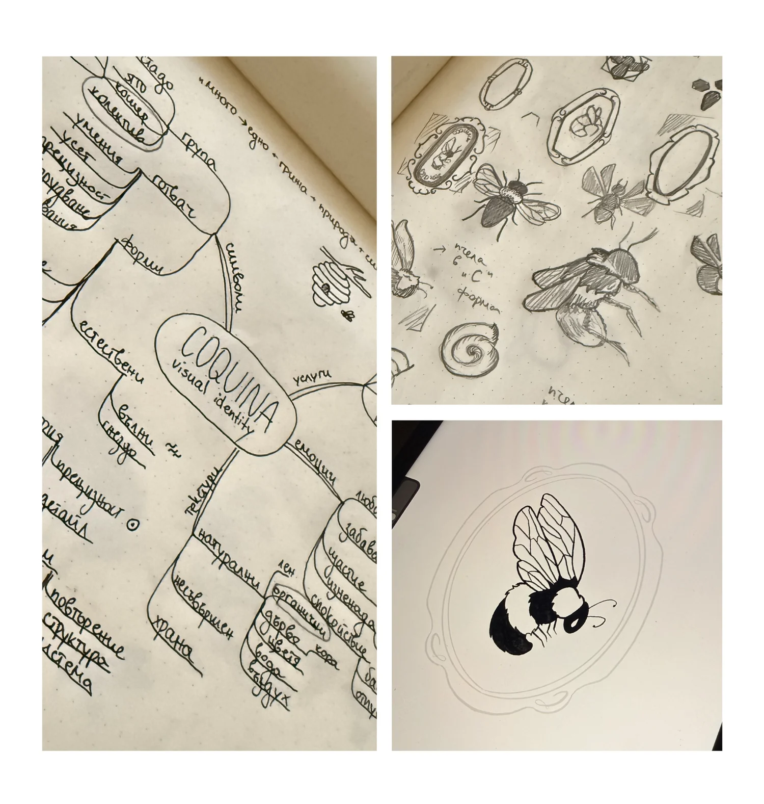
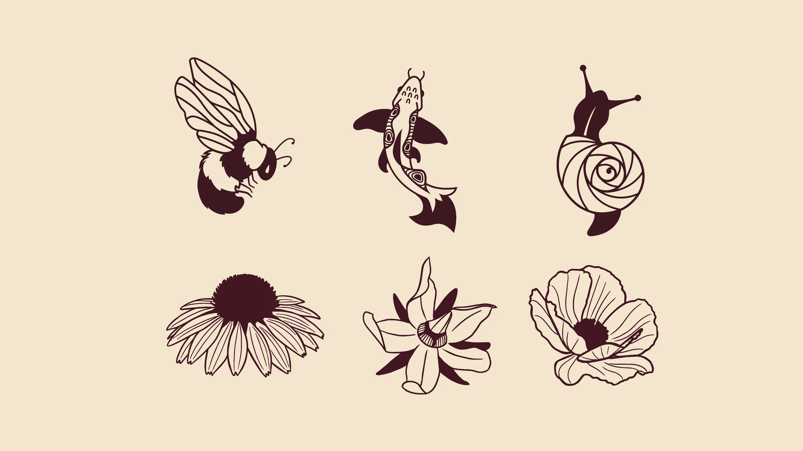
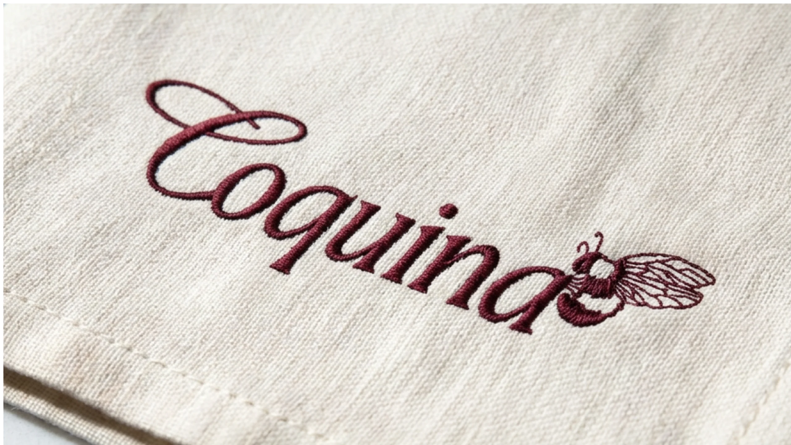
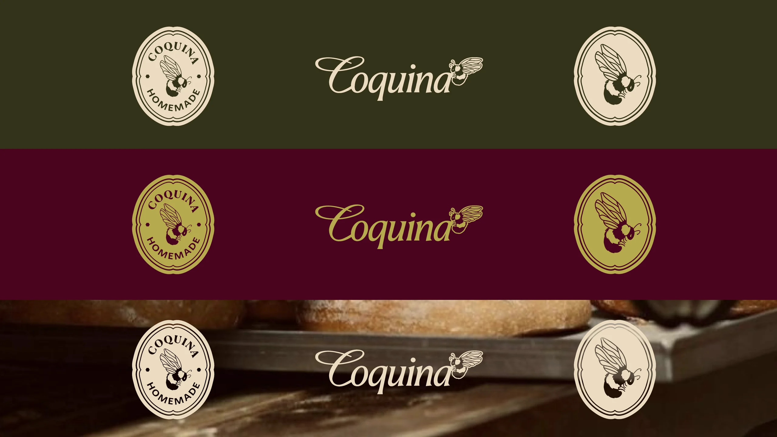
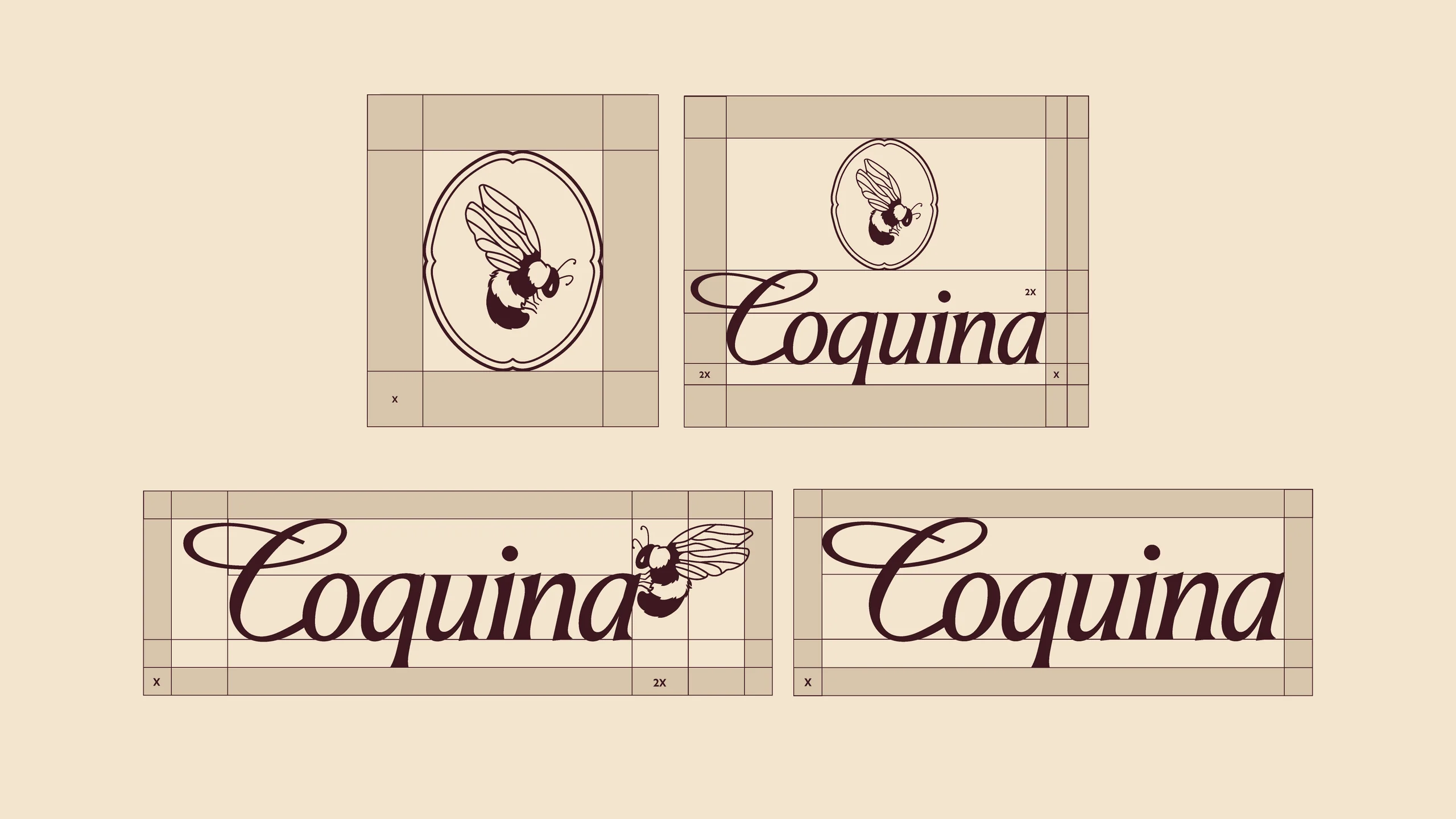
Inspired by that, I created a small ecosystem, featuring different animals and flowers, each having its own role and rooting the brand in nature. The bee is the core element — a symbol of collaboration, dedication, and care. Always in motion, it connects different parts of the ecosystem, helping life flourish through the work it does.
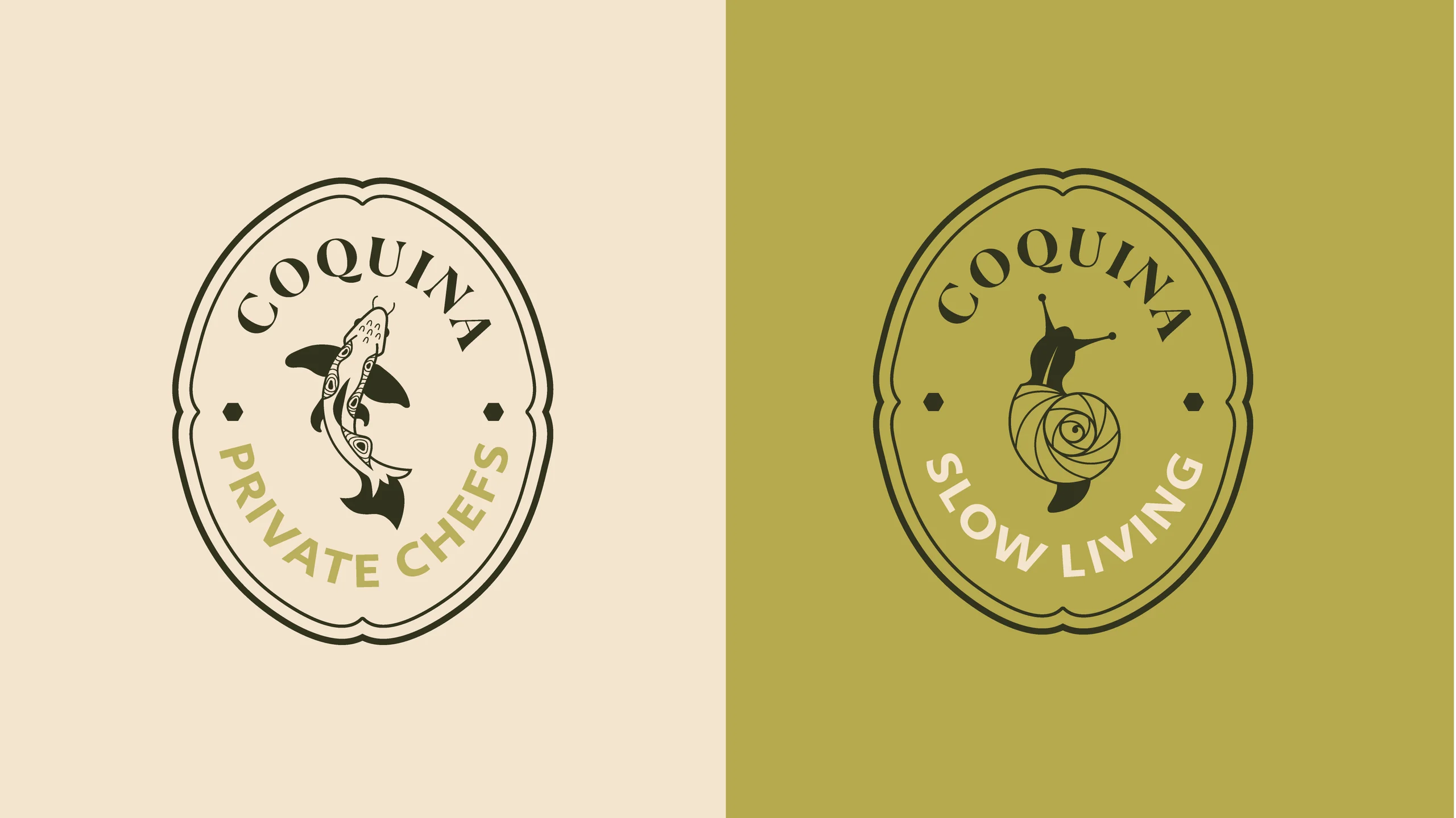
Because the brand provides different services, we wanted to differentiate them in a subtle way. Here came the idea to expand the ecosystem.
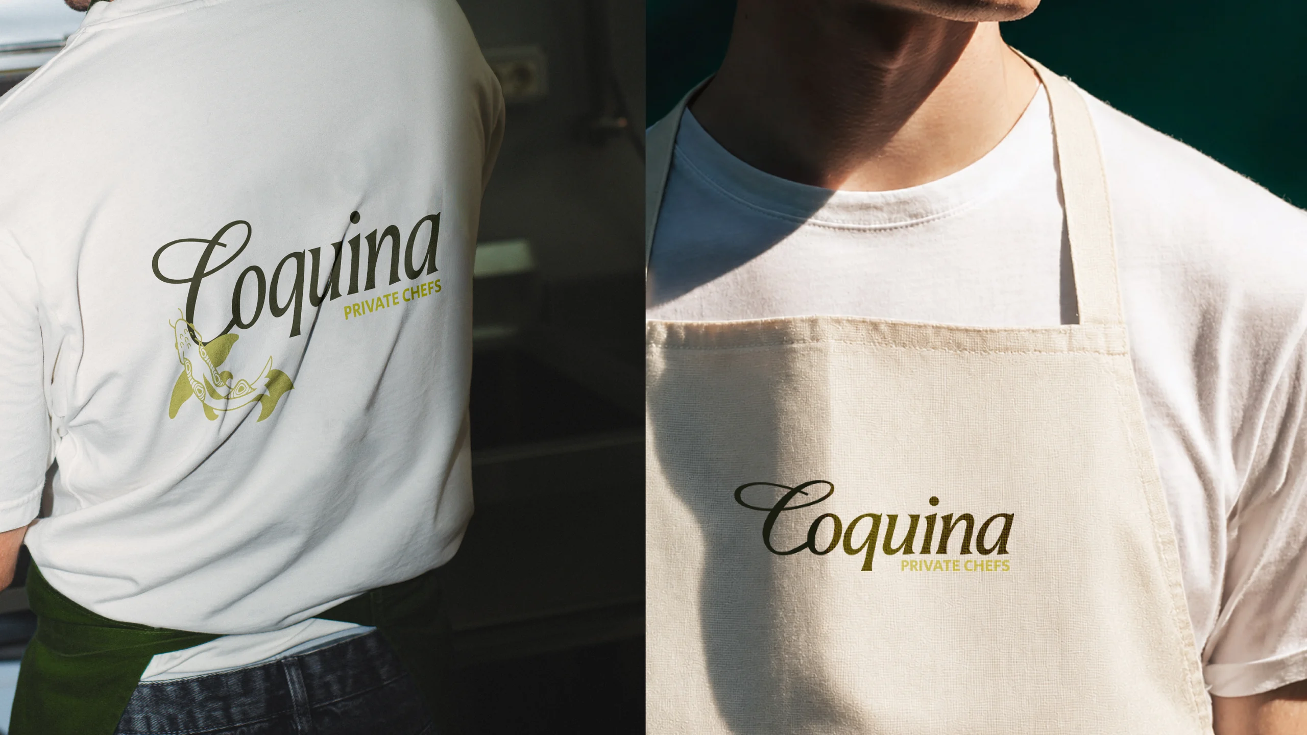
A koi fish — inspired by the santoku knives the chefs use. The distinctive textures of the knives are used as the fish's pattern. A snail — used as a symbol of the slow-living community: slow-cooked food and attention to detail.
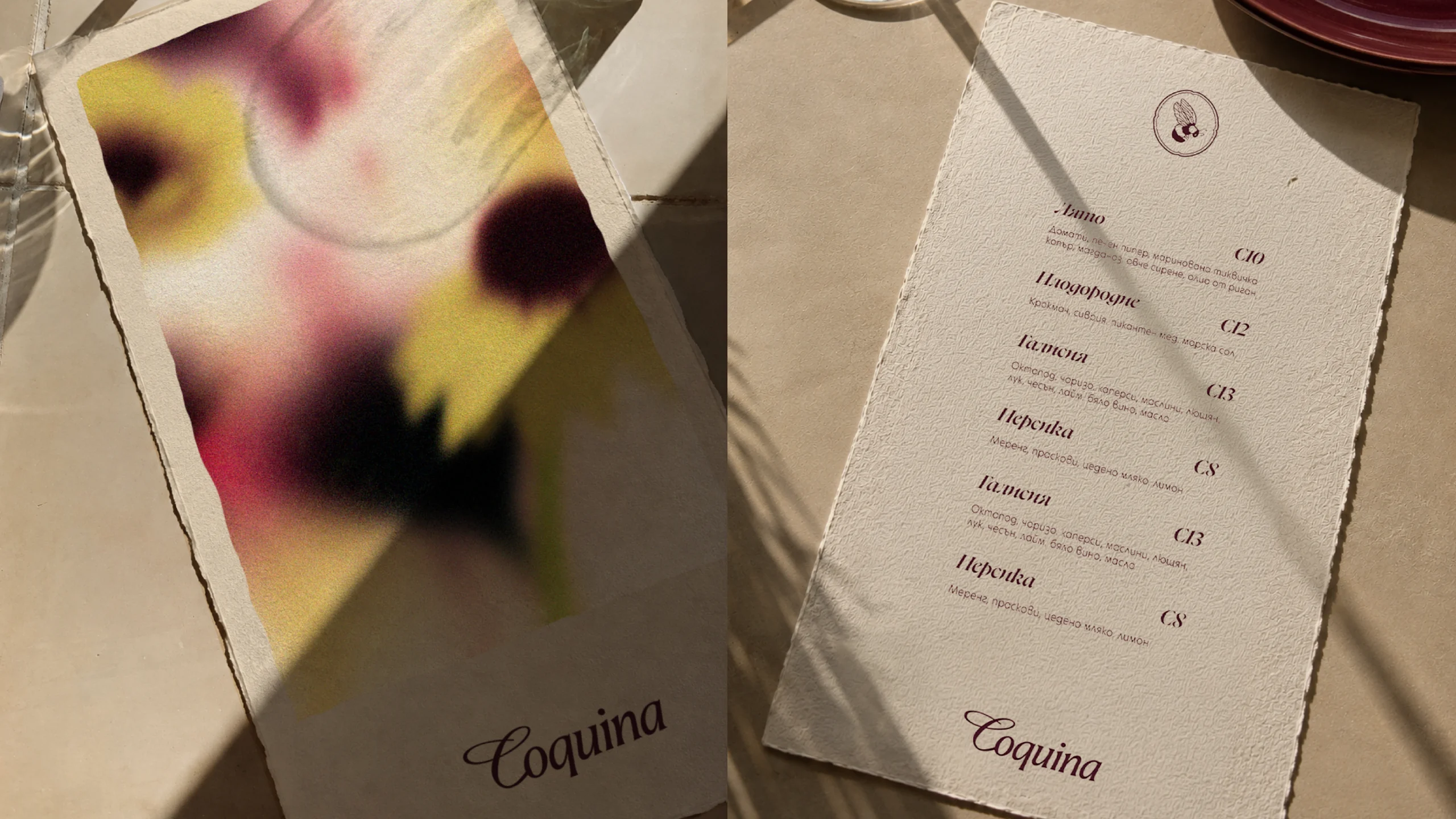

The developed brand illustrations are supported by three different types of flowers, all known to be loved by the bees.